Configure the widget
The four layers of widget configuration, their precedence, and every option the element accepts, listed from the descriptor the widget itself reads.
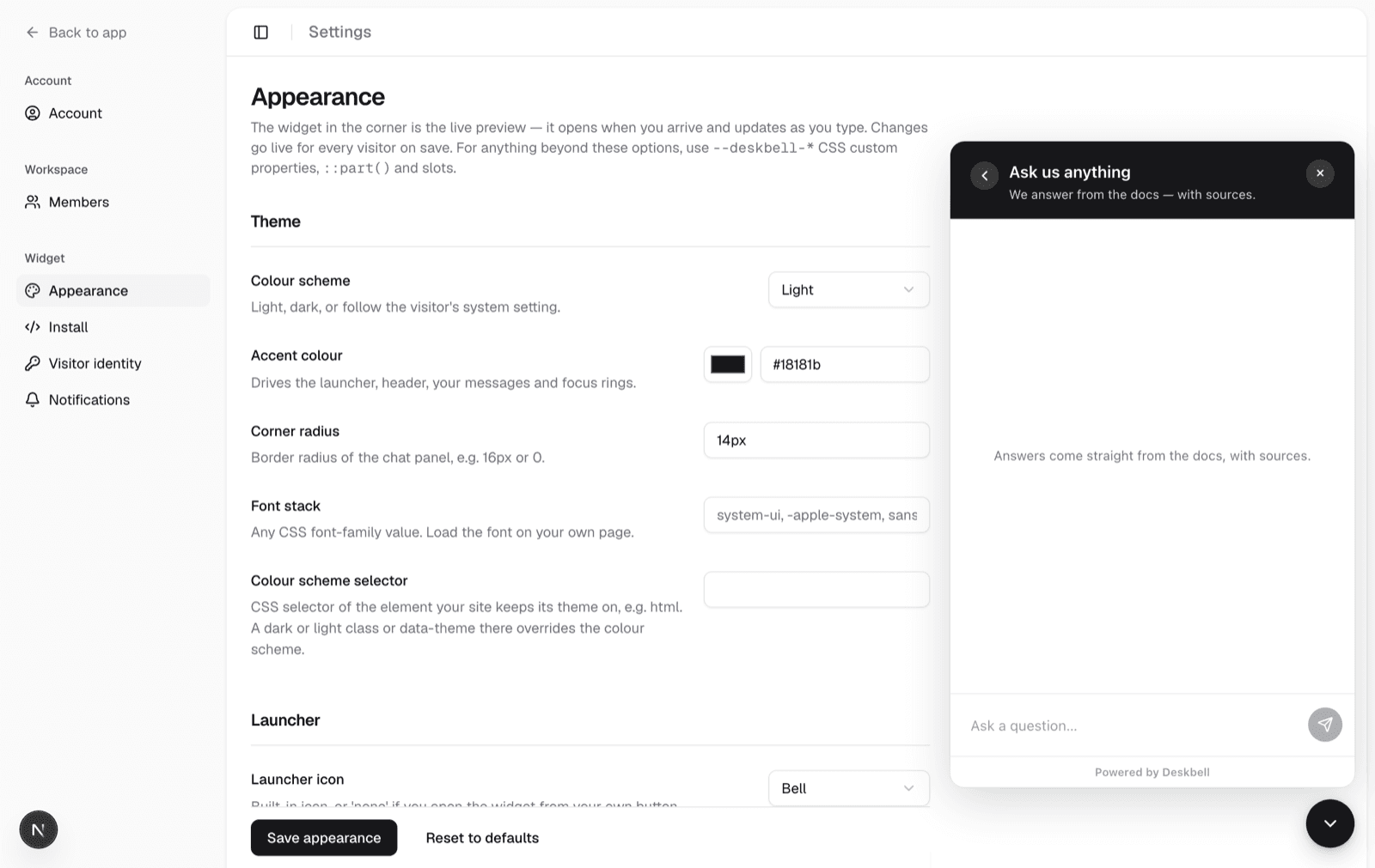
Four layers, each an escape hatch for the one below. Most deployments stop at the first.
- Dashboard. Set appearance under Appearance. No code, no redeploy.
- Attributes. Override anything per page from the embed code.
- CSS.
--deskbell-*custom properties for colour,::part()for shape. - Slots. Replace the launcher, header, empty state or footer with your own markup.
Precedence, lowest to highest:
defaults < dashboard config < attributes / JS config < host-page CSSHost-page CSS wins last on purpose. deskbell-widget { --deskbell-accent: red }
is the most explicit statement of intent on the page, so nothing resolved at
runtime beats it. No rule in the widget uses !important.
Every table in this section is rendered from packages/shared/src/widget-config.ts
at build time. That is the same descriptor the widget, the embed loader, the
React wrapper, the dashboard editor and the database schema read, so this page
cannot list an option the widget does not have.
Options
Each option is an attribute on <deskbell-widget>. On the script tag, prefix it
with data-.
List options are separated by |, because questions contain commas. Object
options take JSON.
Identity
| Attribute | Type | Default | Description |
|---|---|---|---|
project-key | string | — | Public widget key. Not a secret — origin binding is the control. |
api-url | string | — | Your Deskbell server. Leave empty when the widget is on the same origin. |
locale | string | — | BCP-47 tag for the visitor's language. Defaults to the browser's. |
context | context | — | Where on your site the conversation starts, as JSON: { "account": { "id": "…", "name": "…" } }. Stored with the thread, shown in the dashboard. |
readonly | boolean | false | Show one conversation with no composer, for support staff whose token carries the project's staff claim. |
conversation-id | string | — | The conversation to open on load. With read-only it loads through the staff preview. |
Theme
| Attribute | Type | Default | Description |
|---|---|---|---|
color-scheme | light | dark | auto | light | Light, dark, or follow the visitor's system setting. |
accent | CSS value | #2b6b4f | Drives the launcher, header, your messages and focus rings. |
radius | CSS value | 16px | Border radius of the chat panel, e.g. 16px or 0. |
font | CSS value | system-ui, -apple-system, sans-serif | Any CSS font-family value. Load the font on your own page. |
theme | object | — | Fine-grained overrides for any of the widget's CSS custom properties. |
color-scheme-selector | string | — | CSS selector of the element your site keeps its theme on, e.g. html. A dark or light class or data-theme there overrides the colour scheme. |
Launcher
| Attribute | Type | Default | Description |
|---|---|---|---|
launcher | bell | chat | sparkle | none | bell | Built-in icon, or 'none' if you open the widget from your own button. |
launcher-icon-url | string | — | Square image used instead of the built-in icon. |
launcher-label | string | — | Text beside the icon, e.g. 'Ask AI'. Turns the circle into a pill. |
position | bottom-right | bottom-left | bottom-right | Which corner the launcher sits in. |
offset-x | number | 20 | Distance from the side of the viewport, in pixels. |
offset-y | number | 20 | Distance from the bottom of the viewport, in pixels. |
launcher-draggable | boolean | false | Let visitors drag the launcher anywhere on screen. The panel follows; the position is not remembered. |
Behaviour
| Attribute | Type | Default | Description |
|---|---|---|---|
mode | floating | inline | floating | Floating: a launcher opens a panel. Inline: the widget fills its container and is always open; give the element a height. |
open-on-load | boolean | false | Open the panel automatically when the page loads. |
trigger-selector | string | — | CSS selector — clicking any matching element opens the widget. |
hotkey | string | — | Shortcut that opens the widget, e.g. mod+k. Empty to disable. |
conversation-history | boolean | true | Let visitors return to their recent conversations. |
history-layout | stack | sidebar | stack | Stack: a list view behind a back button. Sidebar: threads in a collapsible rail beside the conversation, with delete. |
resume-thread | last | newest | none | last | What a fresh open shows: the thread this browser last had open, the visitor's newest thread, or nothing. |
thread-idle-minutes | number | 30 | A thread silent for this long is not resumed; the next question starts a new one. 0 never rolls over. |
scope-key | string | — | A key of the page's context. When present, the sidebar can show only the threads started under that key's value. |
feedback | boolean | true | Show thumbs up/down under answers. Feeds the docs-gap analytics. |
feedback-reasons | JSON array | — | Reasons offered on a downvote, each with an id, a label and an optional free-text limit. JSON; empty means the built-in three. |
Content
| Attribute | Type | Default | Description |
|---|---|---|---|
suggested-questions | list, max 4 | — | Up to four starter questions shown in the empty state. |
prompt-groups | JSON array | — | Cards in the empty state, each a title, optional description and icon, and up to six prompts. JSON; replaces the suggested questions when set. |
disclaimer | string | — | Short notice above the footer, e.g. that answers are AI-generated. Markdown links work. |
copy | object | — | Override any of the widget's UI strings. |
powered-by | boolean | true | Removing the badge requires an enterprise licence. |
Where the rest lives
- Theming: tokens, parts, slots, following the page's theme, and the recipes.
- Behaviour: inline mode, welcome cards, feedback reasons, the thread sidebar, where a conversation starts, the draggable launcher, the disclaimer, answer formatting and branding.
- JavaScript API: commands, events and lifecycle.
Docusaurus
Add the Deskbell widget to every page of a Docusaurus site through the scripts entry in docusaurus.config, with the project key as a data attribute.
Theming
Restyle the widget from the outside with CSS custom properties for colour, ::part() selectors for shape and layout, and named slots for your own markup, plus the side-panel recipe.